

A dashboard should make the next decision easier. More charts do not automatically create more clarity.
Begin with the meeting
Before choosing metrics, identify the conversation the dashboard must support. Is leadership deciding where to invest, why revenue is behind plan, which pipeline needs attention or where delivery capacity is becoming constrained?
The same business may need several views. A weekly sales dashboard should not carry the same detail as a quarterly board report. Mixing audiences produces crowded reporting that satisfies nobody.
Use a decision hierarchy
Start with outcomes: revenue, margin, retention, pipeline coverage or delivery performance. Then include the few drivers that explain movement, such as lead quality, conversion by stage, average sales cycle or customer risk. Operational detail should be available beneath the headline, not compete with it.
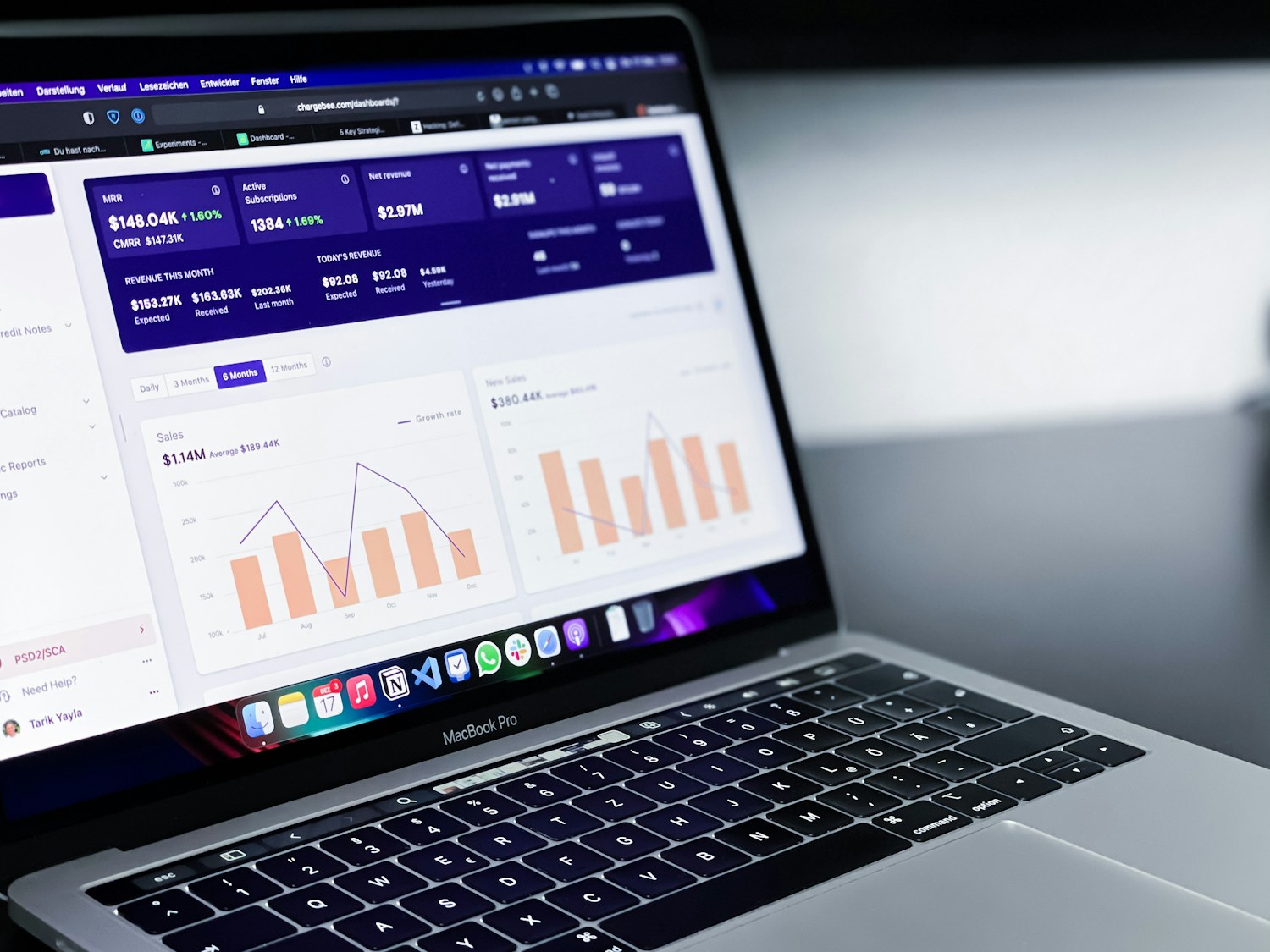
Every metric needs a definition, owner and trusted source. If teams calculate the same number differently, presentation is not the problem.
Design for action
Useful reporting highlights variance, trend and responsibility. It should make it obvious where attention is needed and who can investigate. A red number without context creates anxiety; a red number with a threshold, explanation and owner supports action.

Retire metrics that are never discussed. Add commentary where the number alone could mislead. The best dashboard is not the one with the most data. It is the one that changes a decision in time.